◇ Case Study Report by Pranav

UX Case Study
Wallet: Fixing the Moments Where Trust Breaks
A data-informed redesign of the Wallet app that identifies key user pain points, rethinks core user journeys, and improves usability, information architecture, and overall financial management experience.
Role — UX/Product Designer
Timeline — 3 months, 2026
Focus — Pain-point resolution & user flows
A trust-critical product, approached as a targeted intervention
What Wallet is
Wallet is a personal finance app built to help users manage money across multiple accounts in one place. It should be the single source of truth for their finances. But research reveals the app is failing users at three critical, trust-breaking moments — moments where poor UX design erodes confidence and drives users away.
My role & scope
I approached this as a focused, self-initiated UX case study. Rather than redesigning the entire app, I identified the most impactful usability pain points and redesigned only the user flows where they occurred—creating targeted, practical solutions that could realistically improve the product.
“Wallet doesn’t fail because of bad design overall — it fails users at specific, high-stakes moments.”

Three focus areas
01
Sync failures
When a sync fails, the app doesn't surface a failure state at all. It just stays stuck on "syncing" indefinitely, with no timeout, no error, and no indication that anything's actually wrong. Users have no way to tell whether the app is still working or just silently broken
02
Unclear error states
When something breaks, the error shown is generic and unspecific — it signals that a problem exists but not what caused it or what to do next, leaving users alarmed without a path to resolve it
03
Destructive actions
Deletion is instant and final. There's no confirmation step to catch a misplaced tap and no window afterward to recover what was lost, so a single accidental action can permanently wipe financial history.
Four focused fixes, each aimed at a moment of doubt
Listening to where users already tell you it hurts
With no direct access to Wallet’s analytics or users, I mined public app-store reviews as a proxy for real pain. I collected one- and two-star reviews, tagged recurring complaints, and clustered them by the underlying job that broke. The language people used — frustrated, anxious, betrayed — pointed straight at the moments where trust collapses.
Data collected
Collected 1–2★ App Store & Play reviews.
Pain Point Validation
Coded complaints by underlying broken job.
Prioritization
Grouped into trust-breaking moments.
"My balance shows £500 but my bank shows £2,000. I don't know if Wallet is broken or if there's a delay. This is scary because I use this to make decisions about spending".
App Store review · ★☆☆☆☆
“Deleted an account by accident and lost months of records. One tap, no warning, gone.”
Play Store review · ★☆☆☆☆
“Error 4-something keeps popping up. No idea what it means or how to fix it.”
App Store review · ★★☆☆☆
Why these three, and not the louder complaints
I scored each recurring pain point on three axes: how often it appeared, how severe it felt to users, and how much of it could realistically be fixed through design alone. The three that scored high on all three became the focus.
Pain point
Frequency
Severity
Design-fixable
Verdict
Sync failures
●●●●●
●●●●○
●●●●○
Focus
Destructive actions
●●●○○
●●●●●
●●●●●
Focus
Unclear error states
●●●●○
●●●○○
●●●●○
Focus
Bank connection breakage
●●●●○
●●●●○
●○○○○
Out of scope
Subscription pricing
●●●○○
●●○○○
●●○○○
Not design
Reframing each pain point as an opportunity
How might we help users trust that their data is syncing correctly?
How might we prevent accidental, irreversible actions?
How might we make errors clear and actionable instead of alarming?
From broken moment to designed reassurance
01
Clear Sync Status
BEFORE

AFTER

Built a sync status system with three distinct, always-legible states — actively syncing, synced with a timestamp, and checked with no new activity — each paired with concise, purpose-written copy so users never have to guess whether their data is current.
02
Safer Destructive Actions
BEFORE

AFTER

Destructive actions now require a confirmation that states exactly what will be lost, paired with a post-action undo snackbar. Irreversible outcomes become recoverable, removing the fear of a single wrong tap.
03
Actionable Errors
BEFORE

AFTER

Errors were rewritten in plain language, each paired with a concrete next action and a calmer visual tone. Notifications follow one consistent pattern so users learn what to expect.
Each fix earned its way from rough to refined
Clear Sync Status
V1

Text-only ‘Last synced’ label — easy to miss.
V2

Added color + icon states; still ambiguous when offline.
V3 · FINAL

Final: status
Safer Destructive Actions
V1

Basic ‘Are you sure?’ dialog — no stakes shown.
V2
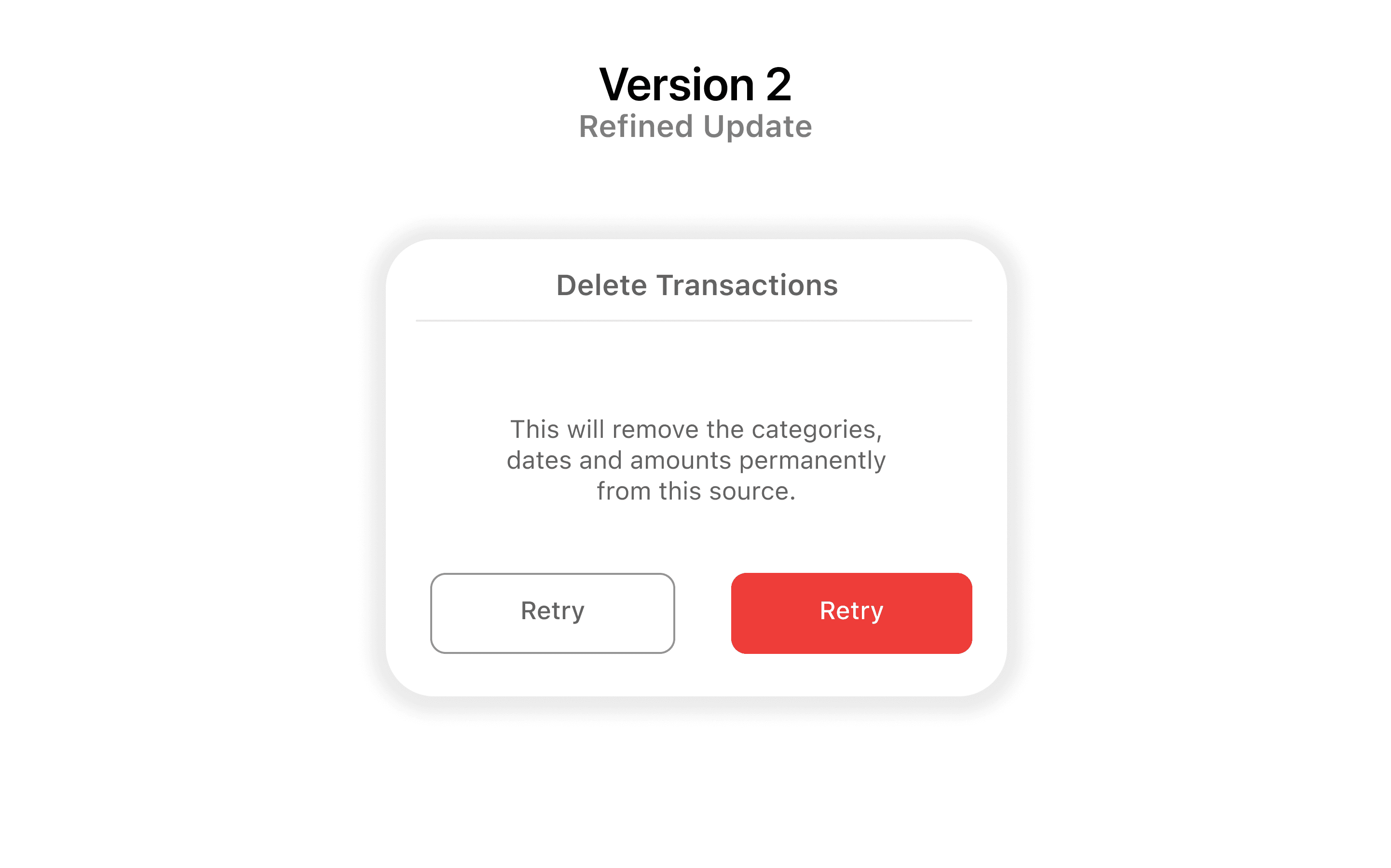
Named the exact data lost; added a hold-to-confirm.
V3 · FINAL

Final: confirm
Actionable Errors
V1

Rewrote copy in plain language, kept red banner.
V2

Paired each error with one clear next action.
V3 · FINAL

Final: unified
The polished result, and a prototype to try it
The three fixes shipped as a coherent set — a consistent language for status, confirmation, and recovery that makes Wallet feel dependable in the moments that matter most.

Sync status

Safe deletion + undo

Actionable error
◇ Interactive Figma Prototype
LIVE PROTOTYPE
Dig into the working files
"Why This Approach"?

What it demonstrates:
Problem Discovery: Ability to identify real user pain points from research.
Prioritization: Focus on high-impact, achievable redesigns over feature creep
Execution: Thoughtful, iterated design grounded in accessibility and platform conventions.
Communication: Clear explanation of "why," not just "what".
Scope Discipline: Knowing which problems to leave out, not just which ones to solve.
Consistency: Solutions that work together as one system, not three separate fixes.
Let's design the moments your users can't afford to lose confidence in.
What it demonstrates
A bias toward evidence over assumption, and the discipline to scope tightly — finding the few moments that carry disproportionate trust, and fixing those well rather than redesigning everything.
How I'd take this further
The redesign decisions presented here are informed by user research and product analysis. In a production environment, I would validate these interventions through iterative usability testing, monitor behavioral metrics such as task completion and error rates, and refine the experience based on measurable user outcomes.
Thanks for reading. If my approach to research-driven product design resonates with you, I'd love to connect.


Pranav's Case Study · 2026